A new era will begin in March 2025 for MotoGP, with a new logo accompanying it. Here are the key reasons behind the logo change.
During the Grand Gala celebrating the conclusion of the 2024 MotoGP season, where Jorge Martin triumphed and secured the world champion title on November 17 after a thrilling battle with Pecco Bagnaia, the new logo for the championship was also revealed. This will mark the beginning of the “new MotoGP” for the next season.

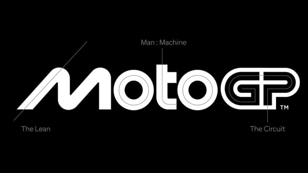
The main goal behind this change was to convey the speed of the sport, which was the ultimate focus of Pentagram, the renowned global design agency responsible for the rebranding of the MotoGP logo. Moreover, the change marks the beginning of a new era for two-wheeled motorsport: the next season will be the first after the acquisition of the championship by Liberty Media, the same company that owns the commercial rights to Formula 1, the high-speed four-wheeled motorsport championship.
On a deeper level, though, why was the previous logo with the checkered flag no longer suitable? First, it’s important to clarify that a logo is not just a graphic element that helps a brand be recognized and distinguish itself from others. It is also a tool through which a brand communicates its values and identity, encompassing all those visual elements that allow it to be identified.
Over the years, the MotoGP championship — much like Formula 1 — has evolved into a full-fledged brand, offering more than just high-speed competitions. It now also provides online and offline content, such as merchandising, that allows fans to be part of the world of the category.
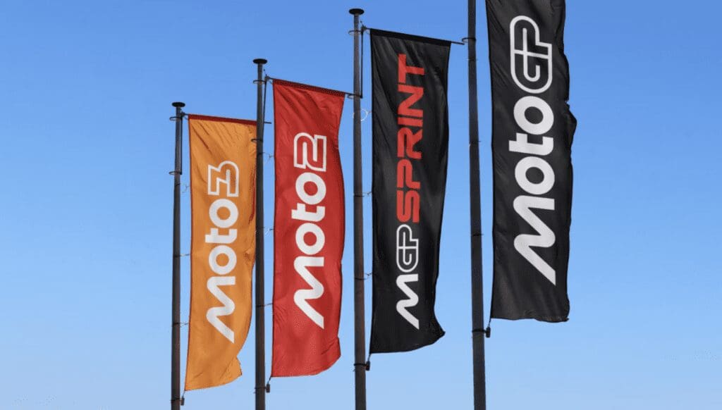
It was also noted that the old logo no longer reflected the essence of the sport in modern times, particularly on digital platforms, even though it still retained its iconic status. Furthermore, the smaller categories, seen as sub-brands, had lost their connection to the core spirit of the brand, becoming less distinctive. With the new logo, however, “different sections of the color wheel have been assigned to the various business areas and sub-brands.”

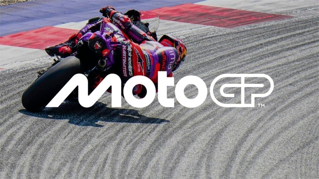
The new logo — accompanied by the slogan “Faster. Forward. Fearless ” and rhyming with the shape of the “M,” which recalls the posture of riders leaning “around corners at incredible speeds” — perfectly embodies the essence of the sport: faster, cutting-edge, and fearless. This is complemented by a new typeface designed in collaboration with F37® Foundry. Additionally, during the last Grand Prix of the 2024 season in Barcelona, a short film was released to mark the launch of the new MotoGP identity, produced by Nomad.
In conclusion, we can say that the new logo looks toward the future and the new chapter with Liberty Media, while still paying tribute to the long-time fans of the sport and welcoming new fans with a logo that captures the pure essence of two-wheeled motorsport.
Photo: Pentagram.

